Swadesi Chicago
Branding, Print Materials, Package Design, Merchandise, Experiential Design
Swadesi opened it’s doors in March 2024 with the aim of introducing Chicago to the vibrant cafe culture of India. Demonstrating a distinctive approach, Swadesi merges traditional Indian elements with contemporary flavors, as reflected in the branding.
As the owners were preparing for the opening I was responsible for carrying the brand across different medias. From menus to packaging to signage, it is all curated to create an inviting culinary experience for our guests.

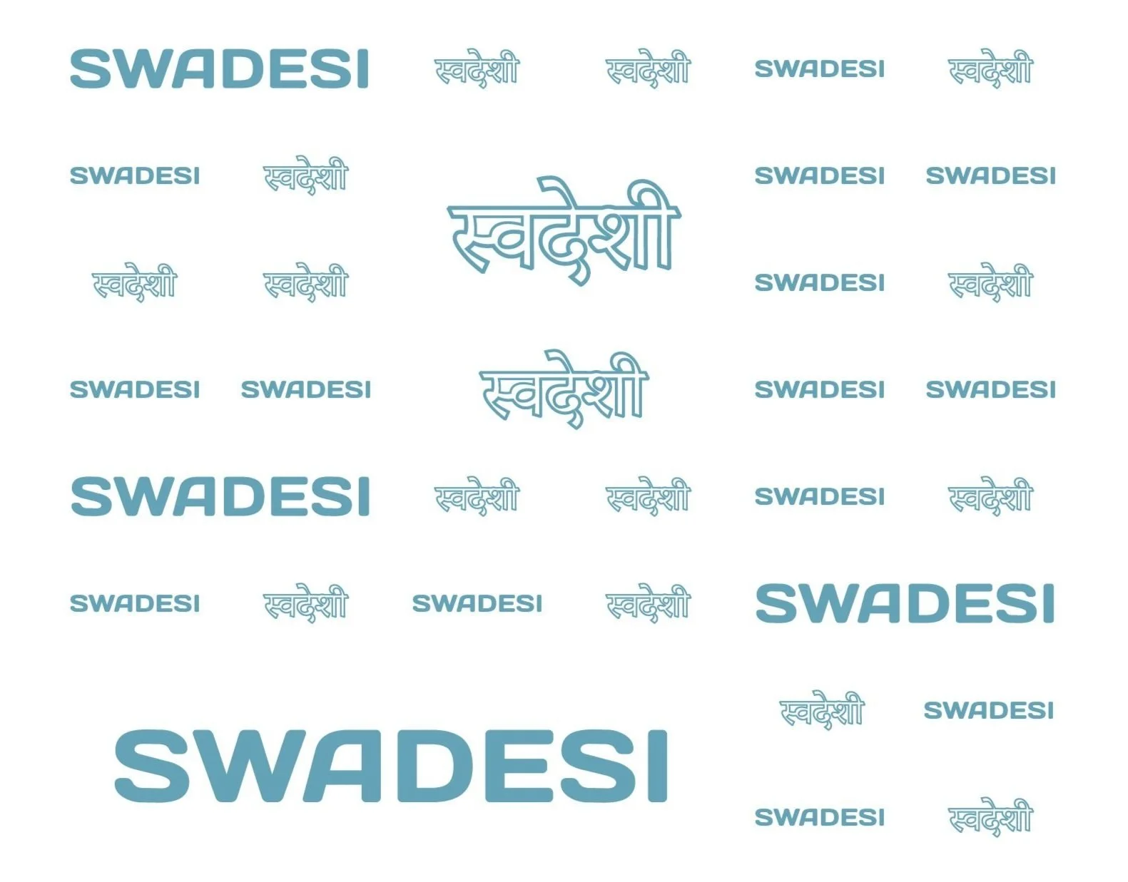
The Branding

Swadesi’s brand revolves around a core set of colors. These colors are used in the interior, exterior, menu, and all other aspect of the cafe’s design.
Service Details

The experience is in the small details. Swadesi’s branding is shown in every aspect of the cafe, from the employee t-shirts to the butter paper and everything in between.


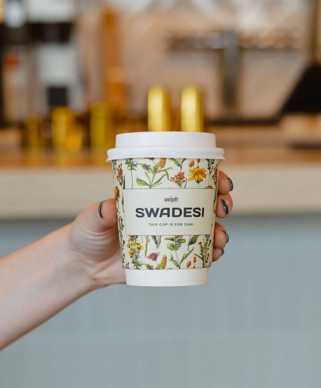
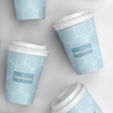
The coffee cup design plays a crucial role in defining the cafe's identity. A distinctive cup will enhance Swadesi's visibility and set it apart from other cafes. The following are my iterations of the coffee cup designs, we went with a floral Indian wildflower design that matches the interior asthetic of the restaurant.
Packaging Touchpoints


Menu Design
The Swadesi menus consist of the cafe menu board and print menus. The menu displays all food, drinks, and pastries and werte kept simple and easy to read.
Outer Building Design
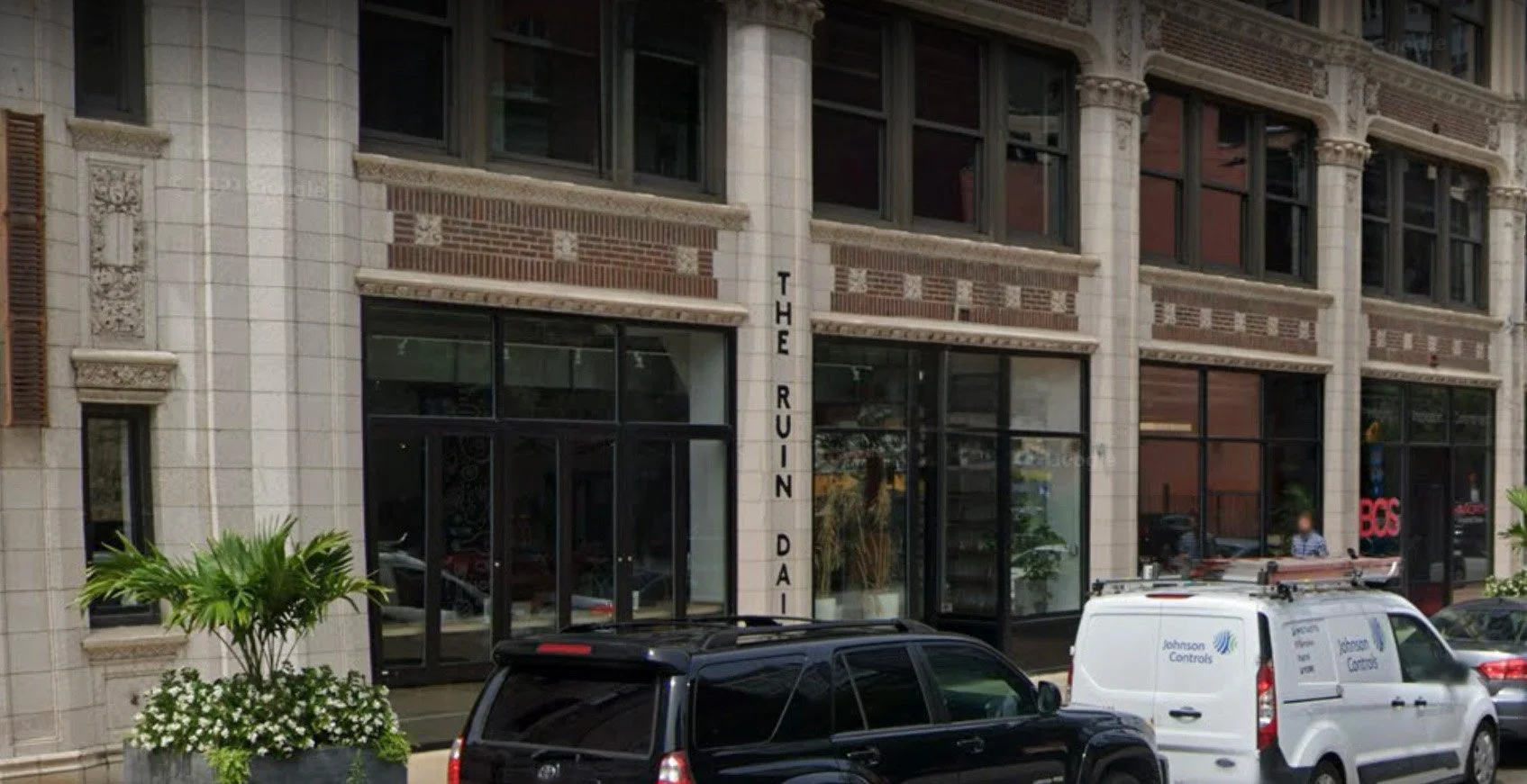
The outer walls of the Swadesi building were painted with the previous business’ name. Our solution to this was to create a decal to integrate this area of the all with the overall aesthetic of the cafe.
Our team’s goal was something bold and recognizable; something to make passerbys stop and take a picture. The Final building design allows customers to take a picture of their coffee cup with the floral cup design. It also includes the cafe’s instagram handle bringing the cafe more traction.